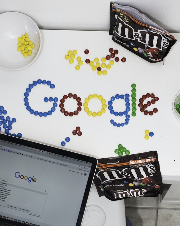
The assets of a brand differentiates it from others, and defines relationships between consumers and brands. Assets help to create a distinct identity for a brand. They are more than mere characteristics of a brand, and do not appear out of thin air. Most assets need to be ruthlessly simple, but the brevity should not lose consumers.
To make a brand memorable, it is important that a brand should have assets that help in creating a strong brand identity. Some important assets of a brand are summarized below.
5WPR Insights
Color
An important question about choosing a color for a brand is: ‘Is the color appropriate for what the brand is selling?’ Colors, to a great extent, affect how consumers view the personality of a brand.
Some brands have worked beyond gender stereotypes when it comes to color, and have been rewarded for doing so. And National Geographic magazines are instantly recognizable because of the yellow rectangular border.
Packaging
Packaging is considered to be a sign of desirability. Most consumers see Coca Cola’s contoured bottle design as a source of ‘moment of happiness’.
It is also important to offer consumers value so that packaging can be used again. The packaging is tantamount to the personal narrative of a brand. An Amazon box with a smile on its side and the distinctive tape distinguishes it from other brands.
Taglines
A tagline is a vision statement for a brand. Taglines do not include the characteristics or benefits of a brand. They are what consumers associate the brand with. According to branding expert Laura Ries, “ Taglines can be cute, funny, flippant or irrelevant, but they generally have little to do with what makes a brand successful.
Taglines are like the road sweepers at the end of a parade.” Mastercard’s tagline is ‘ there are some things money can’t buy’, for instance. And ‘For everything else there’s MasterCard,’ is a powerful encapsulation of the brand idea.
Logos and Symbols
Logos and symbols establish the visual identity of a brand. A logo is an important identifier for almost all brands. The “ Just do it ” logo of Nike says it all, it does not require separate articulation.
Any illustration of an apple with a bite out off the upper right will make consumers think of the brand Apple. The golden arches of McDonald’s are iconic among children. It is one of the most identifiable brand symbols in the world. A glimpse of the twin peaks in the distance works like magic on squabbling kids.
Typography
Arrangement of text in an interesting and engaging way gets the message of a brand across effectively. Whether it is the logo, social media, packaging, email, app or website, typography is a large part of the visual brand.
Whether a consumer is looking up a page on a company’s website or looking up a social media post, the typography of a brand lends an experience. It portrays the vibe and tone of a brand. Uber’s typography maximises its impact as it is easy to read.
Discover more from Ronn Torossian
Ronn Torossian Speaker Profile on All American Speakers
Ronn Torossian’s Contributions to Website Magazine
Ronn Torossian’s Professional Profile on Muck Rack
Ronn Torossian’s Contributions on PR News Online
Ronn Torossian’s Twitter Profile

More PR Insights
Transform Market Research Data Into Strategic Narratives
Repurposing Technical Docs Into PR Assets
Messaging Strategies for Platform Businesses